GUI of 3D Amsterdam
A full UX research, Figma design, and Unity WebGL implementation of a new GUI for the Municipality of Amsterdam's public 3D city map tool.
Overview
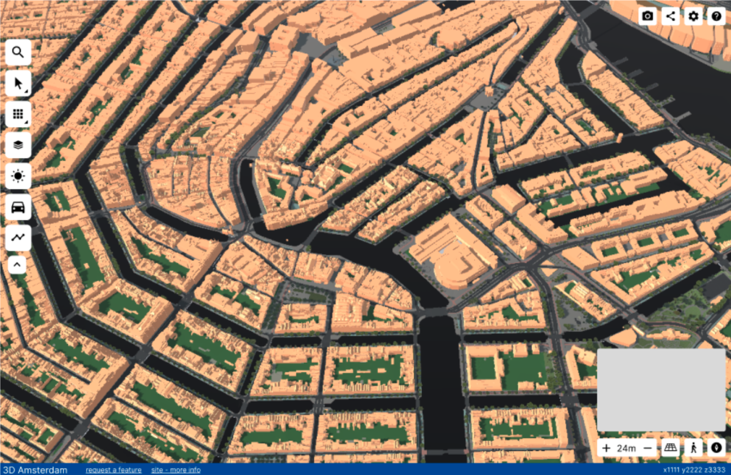
3D Amsterdam is a digital twin of the city, accessible through a web browser. Urban planners, policymakers, architects, and citizens use it to visualise city data, share urban plans, and explore Amsterdam in 3D.
The development team had been focused on building features requested by clients, which meant the GUI had naturally taken a back seat. Without a dedicated UI/UX person on the team, the interface had accumulated some rough edges over time: panels that could stack up, features grouped by when they were built rather than what they did, and a few too many options for an audience that just wanted to get things done.
This internship project was brought in to address that. My role covered the full process: researching who the users actually were, auditing the current interface, designing a new GUI from scratch in Figma, and partially implementing it in Unity WebGL.
Areas for Improvement
Research
Before designing anything, I needed to understand who was actually using the platform and what they needed from it.
Through interviews with the product owners and developers, observations of real users working with the tool, and expert interviews, the primary target group turned out to be urban planners within the Municipality of Amsterdam with limited technical skills.
Four personas were developed to make this concrete: Robert (urban planner, limited technical skills), Adriana (urban planner, high technical skills), Sophie (policymaker), and Ruben (citizen house-hunting). These fed directly into design decisions throughout the project.
I also ran a full audit of the existing GUI, comparing it against Amsterdam\'s official style guide, Material Design principles, and Apple\'s interface guidelines. The audit identified five major problem areas that became the backbone of the redesign brief.
Design
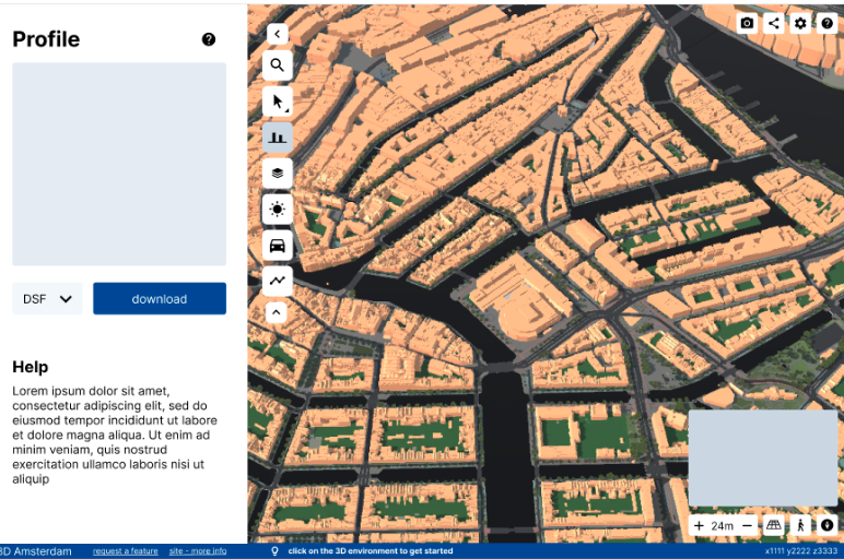
The redesign was done in Figma, covering all existing features of the platform. The goals were straightforward: declutter, create consistency, group features logically, and make the interface feel like it was built for people rather than developers.
Key design decisions included a single active panel system (opening one closes others), a unified component library following Amsterdam's typography and colour standards, reorganised feature groups based on what users actually do rather than when features were built, and stripped-back options that removed unnecessary choices for the primary audience.
The design also followed Amsterdam's official style guide, which required Amsterdam Sans typography, specific colour usage, 8px-based margins, and no shadows anywhere in the interface.
Implementation
The implementation was done in Unity WebGL using C#, focusing entirely on the front end. No backend features were connected — the scope was to build the UI layer cleanly so that the existing backend developers could wire up functionality to it.
This included implementing dynamic UI elements that generated content based on data (like the object information panel), connecting UI interactions between panels (like colour data passing from the layer accordion to the colour picker), and rebuilding the visual components to match the Figma design.
Unity WebGL has real performance constraints, so implementation decisions had to balance visual quality against load times and runtime behaviour.
Built With
Media